Tuesday, 18 October 2011

Web design - "Understanding common web coding protocols"

The purpose of a web browser is a software application can retrieve, pretent , and traverse information on the world wide web (www). To let us see the content on the internet a web browser will render HTML into content. So that see can see images and text on the site. There are a number of web browsers that people can use. There is ,internet explorer , Safari , Firefox  and Google chrome.

HTML (hypertext mark-up language ) XHTML (Extensible hypertext mark-up language) and CSS ( Cascading Style sheets) are all common web coding language and are basic building blocks for any type of web page. When making a website you must include these otherwise your information you want on your page won’t show. When making this on Notebook you have to open and close the code, you open it by putting <head> and close it by </head>.
Web coding protocol let the developers of the websites to add things to their pages. For example they can add images on to the website by putting <img src = “picture”>. This will add the image to the page. You can also add Hyperlinks to the page, you can do this by putting <a href = “the website” > Home </a> you can use this for links around the site or for links to other websites. Websites can also use Meta tag. A Meta tag doesn’t affect or show on a page. Instead it provides information on the page, for example, how often its updated or what it’s about. The information can be shown in the “head” of the pages. The Meta tag is also used in search engines such as Google and Yahoo.

This is a typical structure of a coded page.
<html>

<head> This information isn’t shown on the page </head>

<style type="text/css">

<title> What the page is called </title>

<body> what the website includes i.e Pictures , information , background colour , font ,size. </body>
</html>

WYSIWYG , stands for “ what you see is what you get.” This is a software where it allows you to
make a website without using all the coding to change the look. This still uses the HTML coding.
Other examples of programmes you can do this on is Dreamweaver and expression web.

When publishing a website you have to first make sure that the address you want to use is
Available. You can do this on a website like “go daddy or “123-reg” When you find the address
you want this company will then allow you to store your websites information on their website.
This works via FTP(file transfer protocol) to publish a website it will cost you but it depends on
the type of address you want.


There are many way of promoting a website , the main ways that are used are S.E.O (search
engine optimization) or S.M.O (social media optimization)  These allow people to search for your
websites in things such as Google.

Thursday, 13 October 2011

CD Evaluation

Evaluation

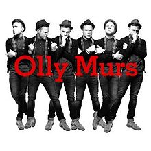
When creating my album cover, I looked at a few different cover before I decided on what genre and artist to base mine on. After looking through I decided to focus on the pop genre and album cover of Olly Murs’ self titled album. From looking at those I discovered the codes and conventions of what a pop genre CD cover included and what appeals to the audience. From looking at pop genre CD covers, I discovered that most background were very plain and that they cover showed the artist either just there face or there whole body. When making my CD covers I took all of this into consideration.

When I started my first version of the CD cover on Photoshop, I started by getting a readymade template of a CD front and back cover and the insides. After the layout was ready, I went on the Internet to find the images of Olly Murs, that I could use for the main image on the front of the CD that I wanted to produce. The first image that I found and that I wanted on my front cover was of Olly Murs, where you could see the whole of this body. In this image he is wearing a Navy jacket. From this I felt that this colour should be the colour of all the writing that I was using. On Photoshop I got the Ink tool and took the colour of the jacket and used it for the writing. I did this as I knew I would be the same colour. I liked this but then I found out that CD itself was red and I felt that these didn’t look right together, so I decided to change the colour to the red that was on the CD. From looking at CD covers I have seen that they need a Barcode and the music companies labels, I got these from the internet and pasted them on to the covers on Photoshop.
On the back cover I decided to stick with the same colours that I had used for the Title on the front cover. I decided to keep this colour throughout the CD as I felt that it flowed and looked good. For the background on the front and back I didn’t have a coloured background. I did this as I felt that if it was coloured it wouldn’t of stand out and I couldn’t find any colours that would have fitted with the image on the front. By having the white background the image and the writing stands out. It is important that things like this stand out on CD covers, as they need to catch the public’s eye.
Inside the front cover I decided to have a montage of images of Olly Murs. I thought by having this it would show the artist in different ways and it would show his personality. By doing it’s something that a lot of pop genre artist do, as their fans like to see lots of images of them. I wanted to try and get images that used the same sort of colours but I was unable to find any. So I decided that I would just get the images and see what they looked like Altogether. Once I had put them all in place I decided that I wasn’t happy with this as I felt it looked cheap and not professional. As this was my first attempt I decided to keep it but change it in the next version.

For my second version I decided to try a coloured image on the front cover. I got this image from the internet and I felt that it would work as it’s a close up image of his face and many pop CD covers have this. As the colours on the image were quiet dark, I thought that I would stick with the same colour of the first version of red as I felt that it stood out from the image.
For the back cover I rearranged the way the track list was. I moved it so that it was in the corner. I did this as I felt that when I had it in the middle on my first version everything seem quiet squashed, where as now it doesn’t. I also kept the Red colour font throughout as I felt it fitted with the CD its self.
As I didn’t like the image layout of my inside page for my first idea. I decided that I would just have one set of image that’s all linked. I got these images off the internet. I changed them into black and white as I felt the colours of the images didn’t fit in with the other colours as they were dark Reds and blues. Although I liked this I still felt that something was needed as I felt that it looked a bit bare.
For my final CD I found an image on the internet that I felt worked well with the colours and layout that I wanted. This image has been used on one of the single before but I wanted to make it different. I took the image and cut the part of Olly out so that I could paste it onto the cover. Once I had placed the image where I wanted, I put the writing next to the image. As for my other two covers I have had the colour red for the writing as I felt that this wouldn’t work for this one as the colour on his top was red and I felt it would of been too much. So I decided to have it Black. Although I changed the colours to black I still thought that the writing stood out because of the white background.
As I liked the back cover in my second version but I felt that it looked a bit plain. I decided to repeat the image so that it didn’t have the white parts on it. I felt that this worked well and it was similar to something I had seen in another pop album booklet.

Overall I am please with my 3rd and final version of the CD cover. I felt that it included everything that a pop CD cover should have and that it looks good and am a similar style to his album which I have based this on.

This is my first attempt 

My second attempt

My final design.

Wednesday, 12 October 2011

Bibliography

Bibliography
Cd covers.

Book covers.

Kayt jones
Nels israelson

CD covers images –

Illustrative photographers

Kayt Jones

Kayt jones is a photographer she does many different types of photography but mainly fashion. Kayt was born  and brought up in London , where she discovered her love for photographer after enjoying taking photo’s for her friends and family. She used to get good comments about her photography. She then went to Westminster university where she studied film and photography and she then went on to graduate in 1996. After a few years she was taking photo’s for fashion magazines and then decided to move out to LA. Since being in LA , she has photographed many different celebrates from Actors to musician. Her works has been on the front of  magazines such as ID , Bazaar , Vogue and Elle. She also does many portrait images of for actors and musician . Kayt is now working on film making  along with her photography.
Kayt jones has done the photography for Olly Murs album which is self tilted. She took a number of images that have been placed on a few of his singles and on his calendars. She has also done album covers for Laura izibor.
Kayt’s work shows the subjects personality off. For example in Olly murs work , he looks quiet fun and bubbly and you can also tell this in her fashion work. In her fashion work she we can see what she wants the subject to look stylish and elegant so that it shows the clothing off in a good way. 

Here is some of the work that she has done.


One of her photo's that has been used for a magaizne cover.


This is a selection of some of her images that she and they were made into Olly Murs album cover.


 Nels Israelson
Nels israelson is a LA based photographer that has been shooting photos for 20 years. He first started photography when he was just 16 and he received amazing comments on some of the photos he had taken. He takes mainly portraiture images and these images are used for advertisement and for covers of CD’s and DVD’s. The images that i looked at are mainly photo’s he has taken with a plain background and then he has edited something in as the background. For example Mcfly single was done with a plain black background and they have edited in a empty room. Some of his most famous work is the DVD cover and billboard poster for Sherlock Holmes and Pirates of the Caribbean.

He also took photo’s for Mcfly , which the images were used for their website , album and single. Other album covers he has done are for Jackson Browne and James brown.
Nels Israelson photo’s show off what the characters are like in their films. For example one of his images of Jonny Depp in pirates of the Caribbean shows that he has a funny side to him in his films.


Illustrative photography

On type of illustrative photography is on Cd covers. These images on the front are important as they portray the way the artist is and whet there songs are like. Depending on what genre the artist or band are, we can normally tell from the CD cover what type of music they do. For example in pop music the covers normally show the artist on the front either just there face or there whole body. The background is normally something plain or something that represents them in a good way. For example the on the Rihanna CD cover it shows a full image of her face another album that shows just the face is Adele’s album. Adele’s album shows her looking relaxed and the image is black and white. This makes to think straight away that the album is quiet relaxed and chilled back.


A rap or R ‘n’b album is different as they tend to have dark backgrounds and don’t normally  show their faces up close there normally far away or have their backs towards the camera. An example of this is Lil Wayne’s album cover , This album cover is dark and shows him standing in the street. This makes you feel that he is quiet bad and that the album isn’t going to relaxed like the Adele album. The darkness of the back also makes you think that the lyric’s in the songs are going to be dark and talk about bad times.


With indie music there images on the CD covers normally give off a fresh and old feeling to it. For example Mumford and sons album they have a image of building which the band standing the window of the shop. It’s sort of hides the identity of the band as you can’t see them up close  , so you don’t really know what they look like.


This album is Olly Murs and its of the pop genre , this is a bit different to your normal pop music CD. As it shows the artist being shown in any different positions but there are a few images of him. Although the background is typical to a normal pop CD as it is plain. This Illustration makes you think that he artist is fun, bubbly and happy and that the music would be the same. 


Here are some more examples of  CD covers............

This is a pop Cd cover from jessie j. This is a typical pop music cd cover as it is a bright cover but it is a close up of her face.

 This is an album cover from example, his music is of the pop/dance genre. The illustration makes you think that he has to types of personality as one is in the dark and one like. This could also be suggesting at his music is like this or that he has two different types of music.


This album cover is for Chase and status they produce Dance music. This illustration cover doesnt show us what the band look like .

This is ed sheerans album and it is for a pop album. This is very basic and plain.


Book illustrative photography

On the front covers of books the illustrative photography is different to CD covers. The images on the front of a book normally represent something that is important to the book ,maybe a character and a location that is also important to the book. The images on books have to be  good representation of the book and they also have to be eye catching as buyers of the book s will be looking mainly for a picture that catches their eye the most. People buy books differently to when they buy CD’s as when people buy CD’s they look for a artist because they like their music but with books, if they don’t know a author they will look at the covers to see what one appeals to them more.

Many books will have there photo’s done on a location not in a studio with a plain background, this is because the location normally tells us what the books about and what genre it is. For example if a couple on the beach like “Dear john” You  automatically think that its a romantic book . With romantic books the colour a normally bright and happy colours , such as whites , blues and pinks.

Here are some examples of romantic book.....


If the book was a horror , the images on the front covers are normally very eerie , For example the images would be of isolated places . The colours that they normally use for Horror books are Blacks and darks blues.


On Autobiography they photography on the front is normally of the person. In this image they want to show the buyers to show what they are really like , they do this so people wanted to buy it will like the look of the person as it might reflect what their book is like. For example The Michael Mcintyre book so him laughing, which makes you think that the book is funny and fun.


Tuesday, 27 September 2011

Self portrait - Evaluations

Self Portrait evaluation

When making our self portrait pictures we used a few different cameras’ the first camera which we uses was the SLR 35mm. In out pairs we took it in turns to take pictures of each other. Once we had done these, we then took photos on the medium and large format cameras. I had my portrait image done on a large format camera, which cam our really well and when being developed had a good effect round the outside of the image. Some of my pictures on the SLR camera didn’t come out very clear, this is as we forgot to check the aperture and that the focus was right.
In my large format portrait photo, I had to stand still for a long while, as Ellis had to sort out the focus. Once all the images had been shot, they were then turned into negatives; they were then ready to start being developed.

We used 8x10 size paper to develop the images on to. To develop them, we had to do them in the Dark room. I placed the large format negative in the middle of the paper and did a test sheet on it. This is where I placed I piece of paper under the negative and I left it exposed in the light for 5 seconds then another part for 10 seconds then another for 15 second. From this I learnt that it need about 10 seconds but if I left it for another second, it could make a difference in clearness. So from this I left the full image exposed for 11seconds. I developed my test sheet and my final picture by firstly placing the images in 3 chemicals, the developer, washer and the fixer. I placed them in the developer for 2 minutes, then in the washer for 30 seconds and finally in the fixer for 5 minutes, this keeps the image to the paper.
I did the same process with my image from the SLR camera apart from I didn’t place it in the middle of the paper. I placed it in the holder on the enlarger. Once the focus was set up I did a test strip and chose to go with 15 seconds as I felt this made the image look the best. Once both of my images were done I checked them in the light and dried them off and I was happy with the way they turned out.
After this process, we had to scan them on to the computer so that we could Photoshop them to make them into a double page spread and we had to add word to them. I started my Photoshop edit by selecting my A3 size so that my image could be across to pages. Once had done this I added the image as another layer and cropped it to the size I wanted and to get rid of the parts I didn’t want. When I got rid of this, I then had to re size it so that it fitted one side of the paper. As one side was my picture, I didn’t want to leave the other side plain white and I felt that this didn’t look right with the picture as it was black and grey. At first I changed it to Black but this look right as the change in colour as the image wasn’t completely black. To change this I took the copy ink tool and used the colour of the photo’s background and made it the background of the other side. This stopped it looking like the colour had changed so suddenly, I also made it look like the colour was fading. I felt that this still could have been improved a lot.
Once I had changed all the background and image we then had to add text to image to explain what we were feeling. This could either have been Lyric’s or sayings. I chose to have lyrics from an Ellie Goulding. I chose these as there my favourite lyrics and I felt that this could relate with the image as this is what I could be thinking. I had these lyrics in White. I thought this would be a good idea as it would stand out from the black background.

Overall I feel that this piece of work had been successful but there are some things I would change if I could to my final piece. I think I would add another image to the piece as I felt this looked a bit care with just one. I did print two images out that I was going to use on my final double page but I felt that this image didn’t look right with the other one, as I was doing two completely different things.


My Large format image that i didnt use.

The developed image that i used.

My final edit for my double page spread.


Sunday, 25 September 2011

Photography - Self portrait artists

Mariell Amelie

Mariell Amelie is a self portraiture that was brought up in a small island in Northan Norway  , where she started her photography but then moved to London to peruse a career in London. Marielle does self portrait photography and fashion. Her work is shown in exhibitions around Norway and her work is also shown in many magazines. Some of her work has been done for commercial use and she does a lot of post production work on her images, to make them better quality.
Her photography of self portrait has a very creepy feel to it as she always looks very serious in her photo’s , like she a manikin. Most of her photos are set in old Retro places or old fashioned places. I like the way that in her photo’s that everything is bright/white coloured as it gives it a clean feel to it. In her photos she shows her feeling in the places that she is in and the actions she is doing. All her images have names For example one is called “Escape” This shows her in room by herself with nothing around her.


Cristina Nunez

Cristina Nunez is a self portrait photographer. She has done this since 1988. She was born in 1962 in Spain where she taught herself about portrait photography. Her photography has been in many magazine around the world including Prestigious magazine. She had also produced a book on her photography called “Body and Soul.”
She started Self portrait photo’s after a five year heroin addiction as she need to express her differcult emotions. She says that from doing this it made her explore her identity and relationships.Cristina has also won many awards for her photo’s in New York and around Europe.
Her photography shows the way that she’s feeling sand the good and bad times in her life. In her work you can tell that she doesn’t care about hpw she looks compared to Marielle Ameile. This makes it feel more real that its a self portrait as not a lot of effort has gone it.